Reading Price Charts/Depth Charts
This article covers:
- How to read three types of price charts.
- Understanding the key information provided in the charts.
- How to read the Depth Chart.
How to Read the Depth Chart?
The depth chart visually represents the order volume for a particular cryptocurrency trading pair. It provides detailed insight into supply and demand dynamics at various price levels, helping traders make informed decisions.
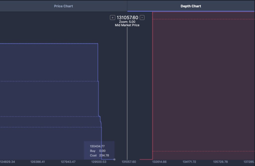
The left side indicates Bids (the highest price at which buyers are willing to buy cryptocurrencies); the right side indicates Asks (the lowest price at which sellers are willing to sell cryptocurrencies).
The horizontal axis represents the price; the vertical axis represents the number of orders for each particular price.
Buy Wall: When a large volume of buy orders is concentrated at a specific price point, it forms a “Buy Wall.” This can act as a support level, preventing the price from falling sharply.
Sell Wall: When a large volume of sell orders is concentrated at a specific price point, it forms a “Sell Wall.” This can act as a resistance level, preventing the price from rising sharply.
Mid-Market Price: (Highest Bid + Lowest Ask) / 2.
How to Read the Price Chart?
You may notice several key pieces of information in the upper-left corner of the chart:
- Time Interval: The time period can be selected under the Price Chart options: 1min / 30min / 1h / 1day.
- Exchange Name Kraken: Displayed in the upper-left corner, showing the exchange through which the trade is conducted.
- Volume (Vol): Represents the total number of cryptocurrencies traded within the selected time interval.
- +/-: Shows the difference and percentage change between the closing price of the previous period and the current period.
Under these three types of price charts, there is another chart displaying the security’s volume, which shows the total amount of cryptocurrency bought/sold in each time period.
There are three types of price charts:
- Line Chart
- Bar Chart
- Candlestick Chart
Reading the Line Chart
Each point on the blue line represents the closing price during that time period, and the line connects these points to show the price movement over a specific time frame.
- X-Axis: Represents time.
- Y-Axis: Represents the price of the cryptocurrency in CAD.
- Line: Shows the price fluctuations over a specific period.
Reading the Candlestick Chart
A typical candlestick chart is illustrated as follows:
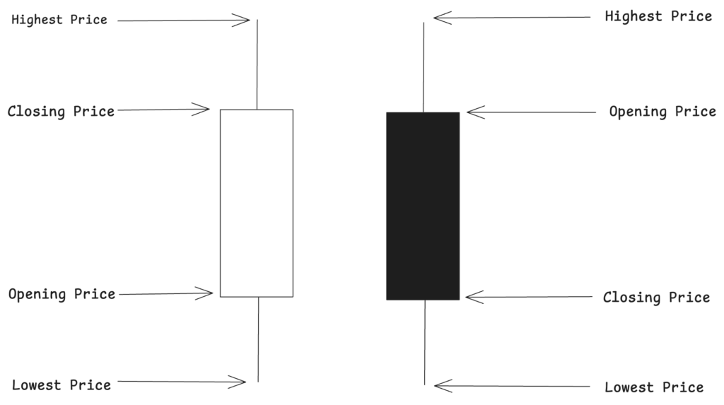
- If the closing price is higher than the opening price, the center of the candlestick is either hollow or green.
- If the closing price is lower than the opening price, the center of the candlestick is filled or red.
- If the opening price is equal to the closing price, the color is the same as the previous day.
- Wick/Shadow: The thin lines above and below the body indicate the price range within that time period.
- Upper Shadow: Represents the difference between the highest price and the opening/closing price during that period.
- Lower Shadow: Represents the difference between the lowest price and the opening/closing price during that period.
The following is a detailed breakdown of the candlestick chart:
- Open: The opening price of the period, represented by the top or bottom of the body, depending on whether the market moved up or down.
- Close: The closing price of the period, represented by the opposite end of the body.
- High: The highest price during the period, represented by the top of the upper wick.
- Low: The lowest price during the period, represented by the bottom of the lower wick.
Reading the Bar Chart
A typical bar chart is illustrated as follows:
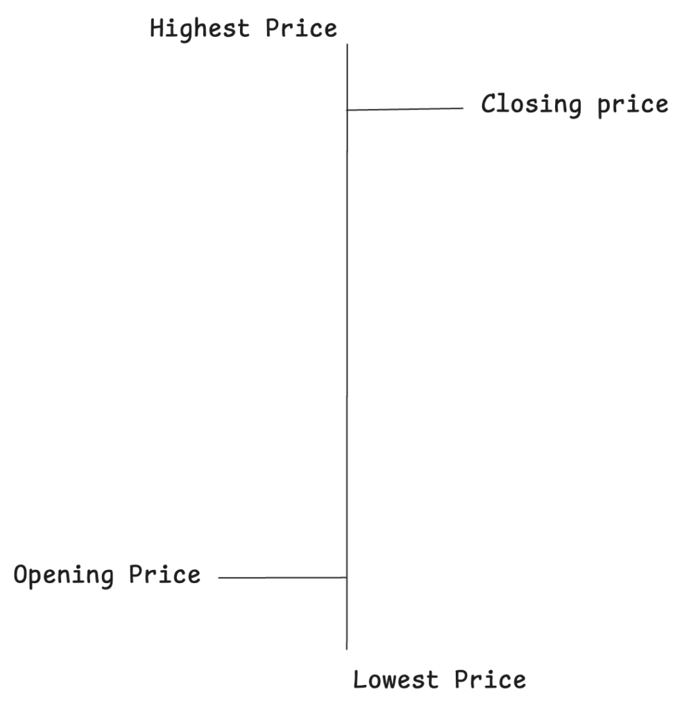
- Vertical Line: Represents the highest and lowest prices during a particular time period.
- High Price: The top of the vertical line shows the highest trading price during the time period.
- Low Price: The bottom of the vertical line shows the lowest trading price during the time period.
- Opening Price: Represented by a small horizontal line to the left of the vertical line, indicating the opening price for that period.
- The opening price is the first price traded during the period.
- Closing Price: Represented by a small horizontal line to the right of the vertical line, indicating the closing price for that period.
- The closing price is the last price traded during the period.
Understanding Key Information in the Price Charts
You may notice a variety of indicators and data points displayed on the chart:
- Time Interval: The time frame for each bar, candle, or line point can be set to display 1-minute, 30-minute, hourly, or daily intervals.
- Volume (Vol): Shows the total trading volume within a specific period.
- Price Difference and Percentage Change (+/-): Indicates the difference between the closing price of the current period and the previous period, shown as both an absolute value and a percentage.
Below the main chart, you’ll also see a Volume Bar Chart showing the trading volume for each interval.
Thank you for reading this tutorial! Whether you’re just starting in trading or looking to improve your skills, understanding the basic principles of reading price charts is an essential step toward successful trading. Market fluctuations are complex and ever-changing, but mastering Candlestick Charts, Bar Charts, and Line Charts will provide you with a clearer perspective, helping you make more informed trading decisions.